The Work Is Never Done
Have idea. Build application. Launch application. Profit. Those are the steps, right? Maybe we could throw another step in, like Add New Feature. Yep, that is it.
If you have a great idea, execute it in some fashion, and add new features people will start using your application and paying you for it. They will flock in droves and you will retire to an island.
Naively, I thought something pretty similar to this up until a few weeks ago. I mean, sure, if you asked me, I would say that I thought it would take Harmony a year or two to really take off, but deep down, I crazily thought it would explode instantly.
The Missing Piece of the Formula
Why would I expect any different? 37signals became an overnight success, right? Oh, and there is GitHub. Man did they explode! The list goes on. The thing is, neither of these companies were actually an overnight success. They were both a year or years in the making. Oh, and there is another item they share — communication.
The tricky thing is that communication is hard work. You have to communicate with your customers through support requests. You attempt to communicate with new customers who you think would benefit from your application. Why do so many marriages end in divorce? Because communication is not always easy.
Communicating in Different Ways
Successful businesses do not just build great products. They also tell you about those products. They iterate not only the product, but the ways in which they get that product in front of your eyes.
I have always been impressed with 37signals rise to fame (how can you not be?), but never more than in the past few weeks as I began to realize all the ways they share their products with you. From design decisions to technical challenges, they continually blog about not just what their applications are or what they do, but why and how they built them. They collect all those thoughts and share them in a book or workshop.
Shared Excitement
The work is never done. It takes a lot to build, launch, and support a product. I am not sure how, but if you stop iterating, if you stop talking about your product, the customers will sense it. Subconsciously, they see that you are tired and not as excited about the product as you once were, so why should they be. Why should they sign up? Why should they continue to pay you?
Here is the great thing though, the flip side is also true. The more excited you get about your product, the more you spend an hour here and there tweaking things, and the more you talk about it, the more excited customers and potential customers will get. The more they will take the time to sign up and try it out, which is all we really ask for. Just give it a try, right?
Applicability
Realizing this, Steve and I have been hard at work — a lunch break here, an evening there, and occasionally pulling out the laptop while watching football on Saturday (and Sunday). We have started stealing wasted hours to do the little things that we know will get people excited about Harmony.
A Month Ago
We started about a month ago, by releasing custom image sizes. This took time from both of us, but was all completed over the course of a few evenings.
We followed that up with theme preview caching, which decreased load time for the administration area. This was surprisingly easy and I completed it on a Friday evening with the TV on in the background.
A Week Ago
Last week, I took some time out of my Sunday to explain how important context and navigation is for your application. I have no problem admitting that the goal of this post was two fold. First, to share an important point. Second, to peak more people’s interest in Harmony, hopefully to the point that they would try it out. It worked. Signups were up for a few days following the post.
Earlier this week, Steve added line numbers and syntax highlighting to our already sweet theme editing area. This was a big win for our customers and ended up not taking more than a couple hours.
Yesterday
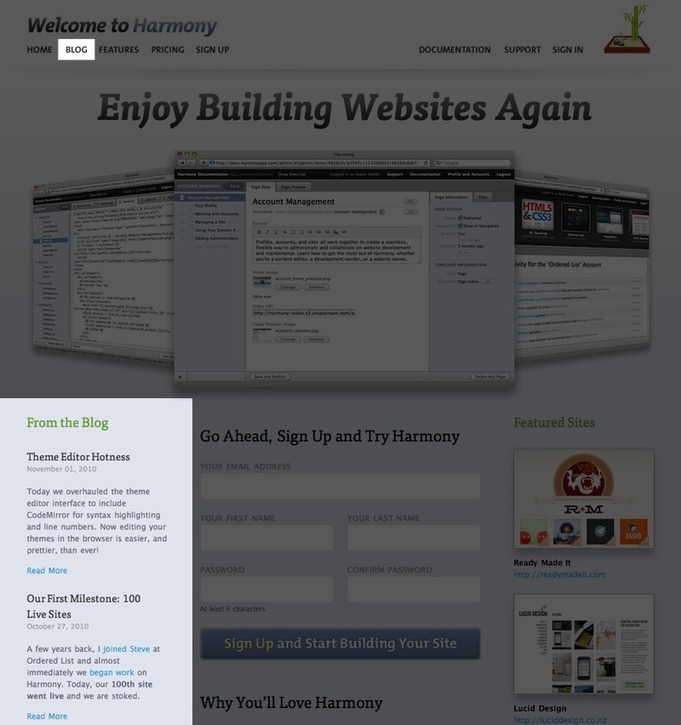
Yesterday, we stayed at the office a bit longer than usual and worked on tweaks to the Harmony website. The first thing we did is split the navigation a bit. The left side focuses mostly on new customers (features, pricing, sign up), whereas, the right side focuses mostly on existing customers (documentation, support, sign in).

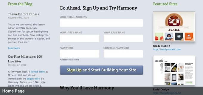
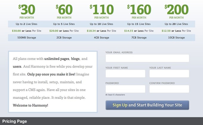
The second adjustment was geared toward making sign up as simple as possible. We only require email, name and password to sign up and try Harmony. Prompted by an article, we removed the rather large sign up buttons we had and replaced them with the actual sign up form on the home and pricing pages.


We also added tracking to each of the forms so that we can figure out which one people are actually using to sign up. In a few weeks or a more, we will know if having the sign up form on the home page helps us or if the real estate would be better spent on something else. Personally, I think it is going to be worth it.
The third tweak was to emphasize communication. Previously, the blog was in the middle of the navigation, but now it is number two. Also, we are now showing recent posts on the home page. We are working hard on additions to Harmony and have been very conscious to update the blog as we go. What we did not do, was emphasize these updates on the website. Now they are.

Only one of these modifications took more than a few hours (image sizes). The majority were TV or internet time converted into something productive towards a product we really care about. Although it is true that the work is never done, I think you would be surprised with what is possible by squeezing a few hours here and there.
I write this post not to toot our horn (though I am stoked), but to encourage you to stop using lack of time as an excuse. Get inspired, execute, and communicate and see what you can build.
Oh…and sign up for Harmony if you have not yet.
